Visualizations for weekly metrics (discourse signups, new topics, posts)

Regularly reading the meeting notes, I often saw the “metrics”, e.g. here: Snowdrift Wiki - resources/meetings/2019/2019-12-30-meeting

It seems 1 → 0 means 1 signup week before last (meeting before last until last meeting) became 0 signups last week (last meeting until this meeting).

Just today I was sufficiently annoyed to hack together a trivial site that enables you to share a link to a line chart, in order to visualize this. Here’s a link for november until now:

https://shak-mar.gitlab.io/share-linegraph/#{"labels":["Nov","","","","Dec","","","","","Jan"],"datasets":[{"label":"Signups","borderColor":"red","data":[1,0,0,0,0,0,2,1,0,0]},{"label":"New%20Topics","borderColor":"green","data":[2,3,2,1,1,1,3,2,3,4]},{"label":"Posts","borderColor":"blue","data":[16,27,26,8,2,2,17,14,13,24]}]}

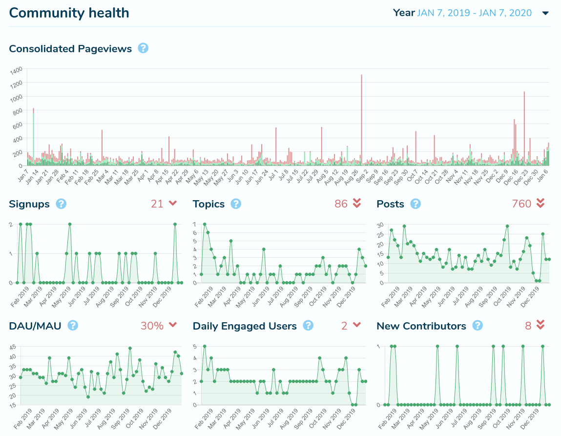
(It’s interesting to notice how forum activity has gone down enormously by the end of november and is rising again now.)

In order to add new data, you need to:

  • Add “” (or %2D%2D if you’re viewing the raw version) before the first ] (or %5D) to create a new place for data, with an empty label
  • Add the number of signups to the first list (i.e. before the second %5D), the number of new topics to the second, the number of posts to the third.

I hope this is simple enough to be convenient and helpful.

1 Appreciation

Added data back to september:

https://shak-mar.gitlab.io/share-linegraph/#{"labels":["","Sep","","","","","Oct","","","","Nov","","","","Dec","","","","","Jan"],"datasets":[{"label":"Signups","borderColor":"red","data":[0,1,0,1,1,0,0,0,0,0,1,0,0,0,0,0,2,1,0,0]},{"label":"New%20Topics","borderColor":"green","data":[1,1,1,2,2,2,3,1,1,1,2,3,2,1,1,1,3,2,3,4]},{"label":"Posts","borderColor":"blue","data":[10,12,16,16,23,28,20,10,10,11,16,27,26,8,2,2,17,14,13,24]}]}

Interesting how whenever there’s a few signups, the number of posts always rises and then falls again after a while. Not sure if this is just random or if there’s a real correlation here.

3 Appreciations

This is awesome! Love the data visualization, I really appreciate you throwin that together

I don’t think it’ll show up in etherpad without at least a plugin but it would be very nice. Even if it showed up on the previous meeting notes would be cool, not sure if it would be favorable to put something like this on the discourse instance itself

This is impressive, mostly that you took the time to do this!

For those with admin access to the forum, there’s already graphs, and we could take some screenshots and publish them here and there. Here’s the past year:

Discussing the meaning / correlations etc. of the stats is a whole other topic…

1 Appreciation

Well, the HTML is only 27 lines. All of them except for one (the data: JSON.parse(decodeURI(window.location.hash.substr(1))),, i.e. the one that extracts the data from the link) are identical to the “line chart” example of chart.js :slight_smile:

2 Appreciations

This is great, thanks so much!