Agreed. I hadn’t even heard of Kofi outside of maybe seeing it in the wiki page. Flattr does have a different model than the others, but not in a way that’s represented in this chart, so I think it doesn’t add much beyond showing we’ve done our research. And I think that’s handled well enough already, since the current draft in the related gitlab issue includes the names of some other projects with its link to our wiki page.
Agreed, and I think that makes it more useful to compare to platforms that are more like us. Once you know how we’re different from OpenCollective, it’s obvious how we’re different from GitHub Sponsors. I think we definitely still want Kickstarter and Patreon, since they are the most popular, but I’m not sure we need GoFundMe (it could replace Kofi in the sentence above).
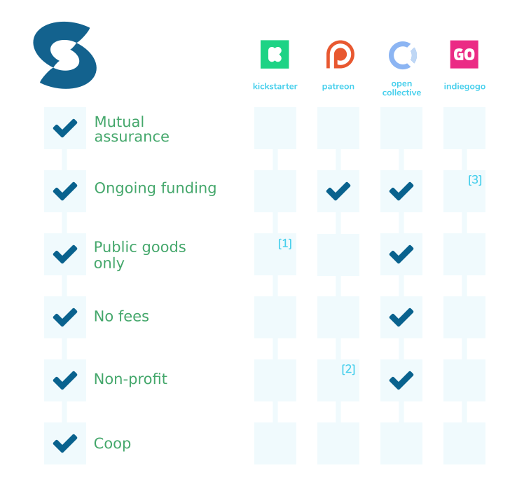
To that end, I think it might make sense to include Liberapay instead of GoFundMe (or OpenCollective); it’s probably the closest to us — ongoing, no-fees (self-funded), non-profit, and itself FLO — so I imagine that’s the first question anyone familiar with the space would have (the other entries are for people not as familiar).
OpenCollective probably more significant Liberapay, probably more total fund processing (didn’t review the stats), more well-known.
I’m fine with dropping Kofi and GoFundMe. I think adding Liberapay makes sense as it fixes the issue with showing who else is closest. Liberapay is certainly closer, and we can check off that it is FLO and no-fee.
So, I’d go with 4 besides us (5 total): Patreon, Kickstarter, OpenCollective, Liberapay
FWIW, those are the ones that I’ve ever had anyone ask about, like explicitly say “how do you compare to X?” and never had that for GoFundMe or Flattr or most others.
I really like the update I just posted above. It’s cleaner and does a better job of trying to show what we are closest to (thus making a better comparison).
Curious what @msiep will think, but I don’t like the footnotes being outside the actual relevant spot in the chart.
I’d prefer a different but still red symbol, maybe a - instead of x. We don’t want a skimming look to mistake it for a check-mark. And really, the footnote being in the right context is enough to make it clearly distinct from a check-mark. So, I like the first variant you did.
…which is visually cleaner to start with, but also might allow for putting footnote indicators in those blank squares in a way that would work visually. It would need to still be very clear that the squares with footnotes in them had more in common with the blank squares than with the squares with the checkmarks in them.
Yes! How would it look with the footnote numbers vertically and horizontally centered? To me they look a bit odd at the top right as if they’re trying to be superscripts but there’s nothing for them to be a superscript to.
First, I would want to put them where they can stay in case of a check mark. (For that it would actually be better in the bottom right corner.) There should also be no confusion about footnotes being used as “some sort of checked” or “even partially checked”.
I’m not sure about the future, but in the case of these 3 particular footnotes, it actually is a “partially checked” situation — these are places where we acknowledge that the platforms have “better than nothing” in those categories even though they don’t match us fully.
I have to say, I really prefer the red Xs. (Or perhaps a red dash, or a red background.) The blank spaces are just a bit too subtle, putting the focus on the checkmarks instead - and we don’t want to highlight what those platforms do have, here, so much as what they don’t have.
The footnote-markers being anywhere but in the spaces they refer to, definitely makes them less intuitive, I’d say. But maybe we could give them a much lower contrast so that they don’t stand out and disrupt the visual organization as much.
The purpose is to compare & contrast ourselves with the others. It’s okay if we highlight the upsides of those platforms when we do that. Unlike commercial organizations, we’re not competing with them, per se. Rather, we’re trying to do something they’ve been unsuccessful at. If one of those other platforms succeeded at funding public goods to the extent we want to see, we wouldn’t really have a reason to exist any more. This would be a good thing — we’d love it if someone else succeeded here!
(that got a little rambly. oops. The perils of forum-ing at night )
I understand, but that still sounds like an argument for representing the similarities equally with the differences, rather than with greater emphasis.
I think the way you all have been posting the table in this thread (with checks and Xs) is the most neutral way to do that. That’s all I meant.
(That and, from a design standpoint alone, I’d want to do something about the unequal visual weight per-box.)