The Context
- I’m currently cleaning up the css of the prototype to make it more maintainable, in preparation for porting it to production.
- Especially, there is currently a lot of duplication. One of my goals is to create more shared classes for styles that are common to multiple pages.
- I’m a relative novice to css. I feel confident enough in my ability to write decently-maintainable css for a single page. However, when it comes to multiple pages, my intuitions start to break down.
- This is the kind of thing I could figure out for myself, but would take more time and much more effort, and would probably take a few tries to hit on the best solution, so I’m hoping to learn from someone with more experience.
The Current state of things
I’m currently working on the auth pages — login, reset-passphrase, and create-account. For now let’s just look at the first two:
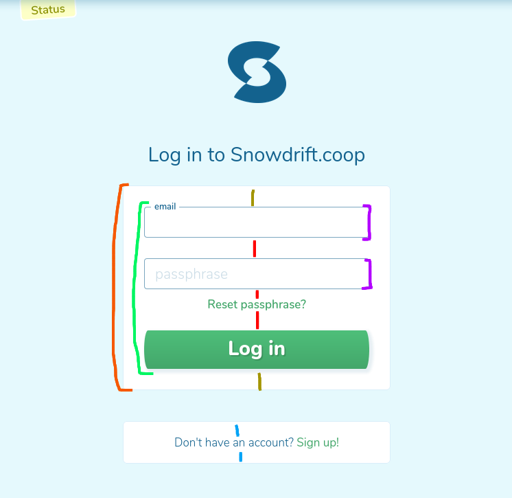

What’s on the page currently:
- Red outside:
.auth-box— width/horizontal placement, border, margins, and padding (yellow)- There is a variant for boxes with forms and for boxes with a single line of text, which have less vertical padding (blue). This style is also used on the create-account page.
- There is also a variant for background color; on the create-account page, the page form backgrounds are swapped from these pictures.
- Green: There’s a form here. Right now it has a class (
.login-form) which is basically being used as an id, to add the various vertical margins on its children (in red). - Purple:
.labeled-input— this is a div containing an input and label; amongst other things, it positions the label when the field has focus or text is entered (the cursor is in email field, in the left screenshot).
On the reset-passphrase side:
- I haven’t cleaned up the css yet, so how it currently is doesn’t really matter
- The red margins above the input fields are the same size as the margin above the passphrase input field on the login page. Also the padding on the whole box is the same (not drawn). The margins above the button/image are essentially specific to this page.
If you want to look at the source:
- Login html
- Login sass
- Auth pages are in the same directories
Intuition & Question
We’re using something like BEM. I think it definitely makes sense to stick with having a labeled-input component, to control label placement behavior. I also think it makes sense to keep the auth-box class, for setting horizontal placement/width and border. But I am struggling to decide how to organize the rest of the properties to keep classes re-usable and also avoid specificity issues.[1]
So, I’d appreciate thoughts from anyone else, particularly if you have more experience with css / insight into what will be useful and maintainable going forward.
-
Edit: I know how I would do it in a different programming language — make a default spacing between elements — adding a
margin-topto.auth-box.--form > form > * + *. But this is overly-specific and difficult to override for the elements that need different spacing. ↩︎